Influenza Project
The United States battles influenza (2009-2017)
PROBLEM |
The United States has an influenza season where more people than usual suffer from the flu. Some people, particularly those in vulnerable populations, develop serious complications and end up in the hospital. Hospitals and clinics need additional staff to adequately treat these extra patients. The medical staffing agency provides this temporary staff.

GOAL |
Examine the trends in influenza and proactively plan for medical staff need dispatch to each State across the United States.

SCOPE |
Examine the trends in influenza and proactively plan for medical staff need dispatch to each State across the United States.
Role |
Data Analyst
Project Scale |
July – October (3 months)
Primary Stakeholder |
CareefFoundary Tutor and Mentor | Data Analytics Immersion Course
Datasets |
- Influenza Deaths: CDC
- Population Data: US Census Bureau
Tools Used |
- Excel
- Tableau
Who is it for?
Key stakeholders include frontline staff at medical agencies, hospitals and clinics utilizing the staffing agency’s services, influenza patients, and staffing agency administrators.
What does it entail?
The storyboard will provide comprehensive information about influenza seasons in the United States, including data on vulnerable populations, influenza-related deaths by state, and forecasts of influenza season trends.
Why is it being built?
This analysis is designed to support planning for influenza season, a period when demand for additional medical staff increases significantly.
When will it be used?
The findings and recommendations are being implemented immediately to prepare for the upcoming influenza season. The goal is to alleviate understaffing pressures and reduce influenza-related morbidity, with a focus on prioritizing states with higher rates of influenza deaths.
Hypothesis |
If a state has a high population of vulnerable individuals, there is a higher likelihood of more deaths caused by influenza.
Descriptive Analysis |

There is a strong positive correlation between influenza deaths and vulnerable populations that showed by the p-value 1.13E-14.
Statistical Hypothesis |
- The null hypothesis: Influenza deaths are more among populations of 64 Years and Under.
- Statistical Terms: H0: μ Influenza deaths ≥ 64 Years and Under
- The Alternative hypothesis: Influenza deaths are less among population of 64 Years and Under.
- Statistical Terms: HA: μ Influenza deaths < 64 Years and Under.

Results |
- The significance level: α = 0.05
- The p-values obtained is less than α, (1.12594690512164E-14 < 0.05).
- Therefore, we can conclude that there is evidence to reject the null hypothesis.
- On average, there are 537 deaths per year among non-vulnerable populations in each state.
- However, there are an average of 897 deaths per year among vulnerable populations in each state.
- While the difference in deaths between non-vulnerable and vulnerable populations is 360, the variance between the two groups is different and large. The sample size of both groups is 459 observations.
- There is a significant difference in the number of deaths between non-vulnerable populations and vulnerable populations. This suggests that the number of influenza deaths (the dependent variable), is influenced by the vulnerable population (the independent variable).
Results Interpretation |
- If the number of influenza deaths is higher among non-vulnerable populations compared to vulnerable populations, there would be less than a 0.5% chance that the difference in the number of deaths (360 deaths – the difference in means) was due to random chance.
- In other words, there is only a 0.5% chance that the 360 difference in the number of deaths between the two groups of non-vulnerable populations and vulnerable populations is not a true difference in groups and just happened to occur by chance.
- This means that it is highly unlikely that non-vulnerable populations are actually no different from vulnerable populations in terms of the number of deaths.
- Conversely, there is more than 99.5% chance that the difference in influenza deaths can be attributed to being among the vulnerable population (65 years and over), rather than just being a random chance.
Statistical Visualizations |
Influenza Deaths: Age Groups
- The box plot displays, with the exception of the 65+ years age group, all age groups have a median of 5 deaths, and that no age group has zero deaths, with a minimum value of 5 deaths in each group.
- The 65+ years age group (vulnerable populations) has the widest range of deaths between 5 to 28, ranging from 5 to 512. The median for this group is 13 deaths. The lower part of the box is smaller than the upper part, indicating that there were more recorded deaths above the median of 13 than below it.
- Surprisingly, the age group of 55-64 years reported the second-highest number of deaths, contradicting the belief that the under 5 years age group has the second highest number of deaths.
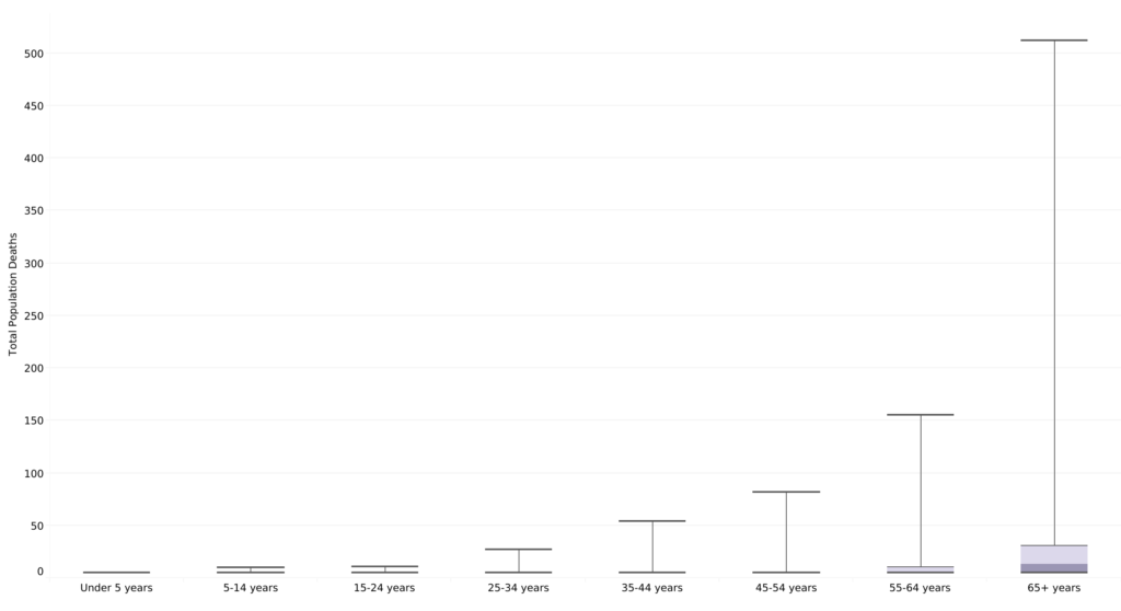
- Upon comparing the populations of different age groups, it is evident that the vulnerable population of 65+ years has experienced the highest number of deaths due to the flu.
- Children under the age of 5 are often considered vulnerable, the analysis shows that they are not as affected by the flu as initially thought. Although they may contract the flu, they typically recover without requiring hospitalization.
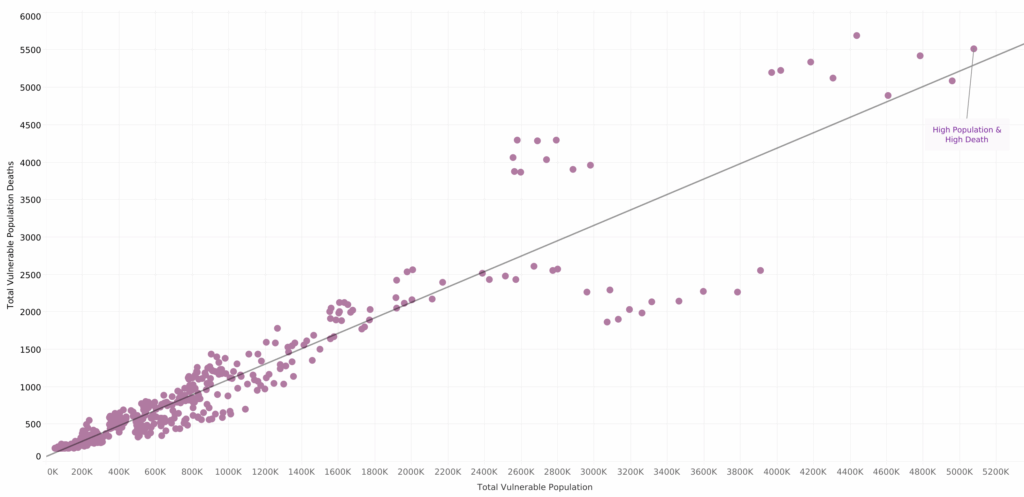
- The correlation between the high population of vulnerable individuals and the total deaths caused by influenza is evident. As the population of vulnerable individuals increases, the total influenza deaths increases as well.
- For example, when the states of California, New York, and Florida were selected, this correlation remained true.
Relationship: The Vulnerable Population and Influenza Deaths |
Spatial Visualizations |
Priority States: High Vulnerable Populations & High Influenza Deaths
The number of influenza deaths vary across different states, as displayed on the map.
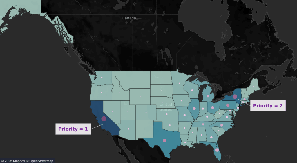
- An example, the state of Vermont has a low number influenza deaths (light blue) while California has a higher cases of influenza deaths (dark blue).
- The circle sizes and color shades indicate the total number of deaths among vulnerable populations in each state. Larger and darker circles (dark purple) correspond to a higher number of deaths among vulnerable populations.
- The urgent need for attention in California, which has the highest number of deaths, followed by New York.
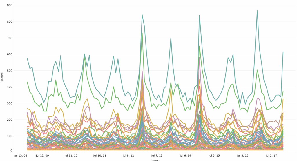
Temporal Visualizations |
The Influenza Season: Timing & Forecasting
- An example, the state of Vermont has a low number influenza deaths (light blue) while California has a higher cases of influenza deaths (dark blue).
Conclusions & Recommendations |
- Vulnerable population of 65+ years individuals are suffering the most from influenza deaths in the united states.
- With the limited resources available, dispatching medical personnel to support in addressing the high influenza death among the
Vulnerable population is based on priority level. - Priority is identified as a state with high population of Vulnerable population and high influenza death.
- The peak of influenza deaths occurs in January.
- It is crucial to send additional medical personnel to the states of California, New York, and Florida in December.
- This will help provide critical support to staff and treatment to influenza patients, potentially mitigating the increase in influenza deaths.
Next steps |
- Arrange a meeting with stakeholders to discuss the findings and reach a consensus on the chosen intervention plan.
- Establish a method for collecting data to evaluate the effectiveness of the intervention plan.
- Implement the plan by dispatching an adequate number of medical personnel to high-risk states with a high influenza deaths.
- Monitor the plan closely and have an emergency team available for any necessary adjustments.
- Begin collecting data and feedback for future analysis.
- Deliver a comprehensive analysis of the intervention plan outcomes to stakeholders within five months after the end of the influenza season plan for future influenza seasons.
Challenges |
- This influenza project was my first assignment with CareerFoundry.
- Generating interim reports was a learning curve for me, but the process made sense every step of the way.
- This was also my first time working with Tableau, and I wasn’t sure what to expect. However, I thoroughly enjoyed learning about Tableau’s various functionalities and discovering how I can use it to convey data and insights to different audiences.
Project Deliverables |


